BUILDING COMPONENTS
Our team follows a structured, collaborative process to build components in the Helios Design System. It starts with a sync to align on the scope of work. We audit existing implementations across product teams, then regroup to discuss common patterns, open questions, and areas for improvement.
We explore external systems and WCAG requirements during the discovery phase, and kick off design iterations with frequent feedback loops. Throughout the process, we partner closely with engineering to validate feasibility and review semantic code structure. We also bring in accessibility experts to review behaviors, interactions, and naming to ensure every component meets AA or higher compliance.
ACCORDION COMPONENT: FROM FIRST LAUNCH TO ENHANCEMENTS
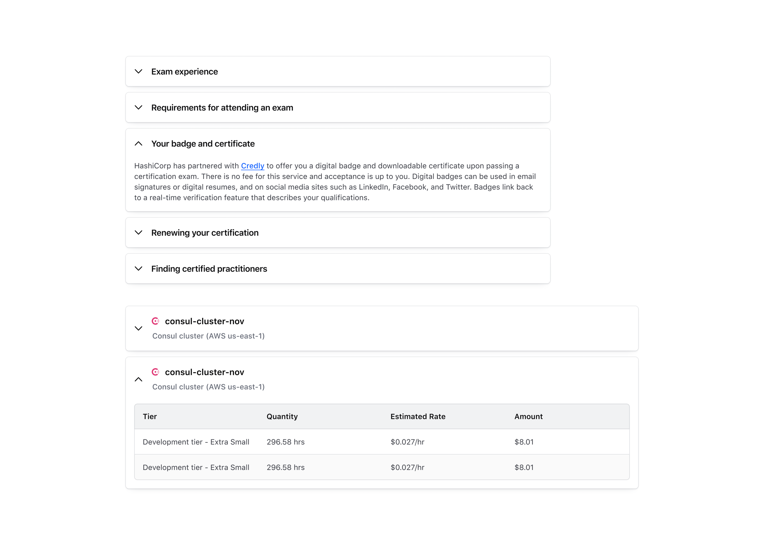
The Accordion component was initially built to bring consistency across our product suite. At the time, many teams had created their own versions with different styles, interactions, and accessibility behaviors. I began by auditing each implementation, then invited designers to contribute their use cases and examples in a shared Figma file.
In parallel, I conducted a competitive audit of other design systems, identifying shared behaviors and accessibility best practices. I synthesized these learnings and designed the first version of the Accordion, prioritizing alignment across teams. I partnered closely with an engineer throughout development and validated keyboard interactions and focus behavior with our accessibility lead.
The final result was a unified, accessible Accordion component with solid adoption across products.
Evolving Needs, Expanding the Component
As time progressed, more teams wanted the Accordion to support new layout and density use cases. I went back to the drawing board to explore enhancements. This included:
Adding a
flushvariant for nested contexts without card stylingIntroducing multiple size options for different visual hierarchies
Revisiting spacing, icon placement, and state transitions for better clarity
We ran another round of reviews with design and engineering partners to validate these additions. Each change was tested against accessibility requirements and real-world implementations. The result was a more flexible, extensible Accordion that could serve additional products without requiring overrides.
Our design system process made it easy to scale the component while maintaining consistency, accessibility, and usability across the board.
Component Building
A cohesive accordion component built to unify patterns, improve accessibility, and support evolving needs across HashiCorp products.
🏢 COMPANY
HashiCorp (Helios Design System)
👥 TEAM
4 Product Designers (including myself)
6 Design System Engineers
1 Design Manager
1 Accessibility Lead
🤝 CONTRIBUTION MODEL
We worked as a cross-functional team of ~12 contributors focused on building and maintaining UI components. Our process included weekly design and engineering syncs to:
Kick off new component work
Align on requirements and constraints
Audit internal usage and reference external systems
Resolve open questions and edge cases
Collaborate on accessibility and semantic markup
Iterate on design and implementation details
Review documentation and approve for release
🛠 TOOLS
Figma
VS Code
Confluence
GitHub
Browser DevTools
Slack & Zoom (for async and live reviews)
📈 RESULTS
Designed and shipped 30+ reusable components across product teams
Standardized component structure and interaction patterns
Authored detailed documentation for each component, including accessibility guidance, usage examples, and code references
Enabled faster design-to-development handoff through clear specs and consistent patterns
Supported adoption across multiple surfaces, including HCP, Vault, and Boundary


