
Helios Design System
How I brought consistency to 9 product teams and cut design time by 60%
Role: Product Designer II
Timeline: May 2022 – Present
Team: 12-person design systems team (3 designers, 3 managers, 7 engineers)
System: Open-source design system meeting WCAG 2.2 AA standards
Users were confused. Developers were rebuilding the same components over and over.
HashiCorp's products looked inconsistent. Each team built custom UI patterns that confused users and slowed development. The company needed a single source of truth for foundations, components, and patterns across all customer-facing products.
I started with the invisible work: tokens, spacing, and color
Helios provides design foundations spanning colors, typography, icons, elevation, borders, and breakpoints, all built with accessibility as a core principle.
Colors that work in any mode
Built semantic color tokens (text-primary, surface-interactive) that work in light and dark mode. All combinations meet WCAG 2.2 AA contrast standards (4.5:1 minimum).

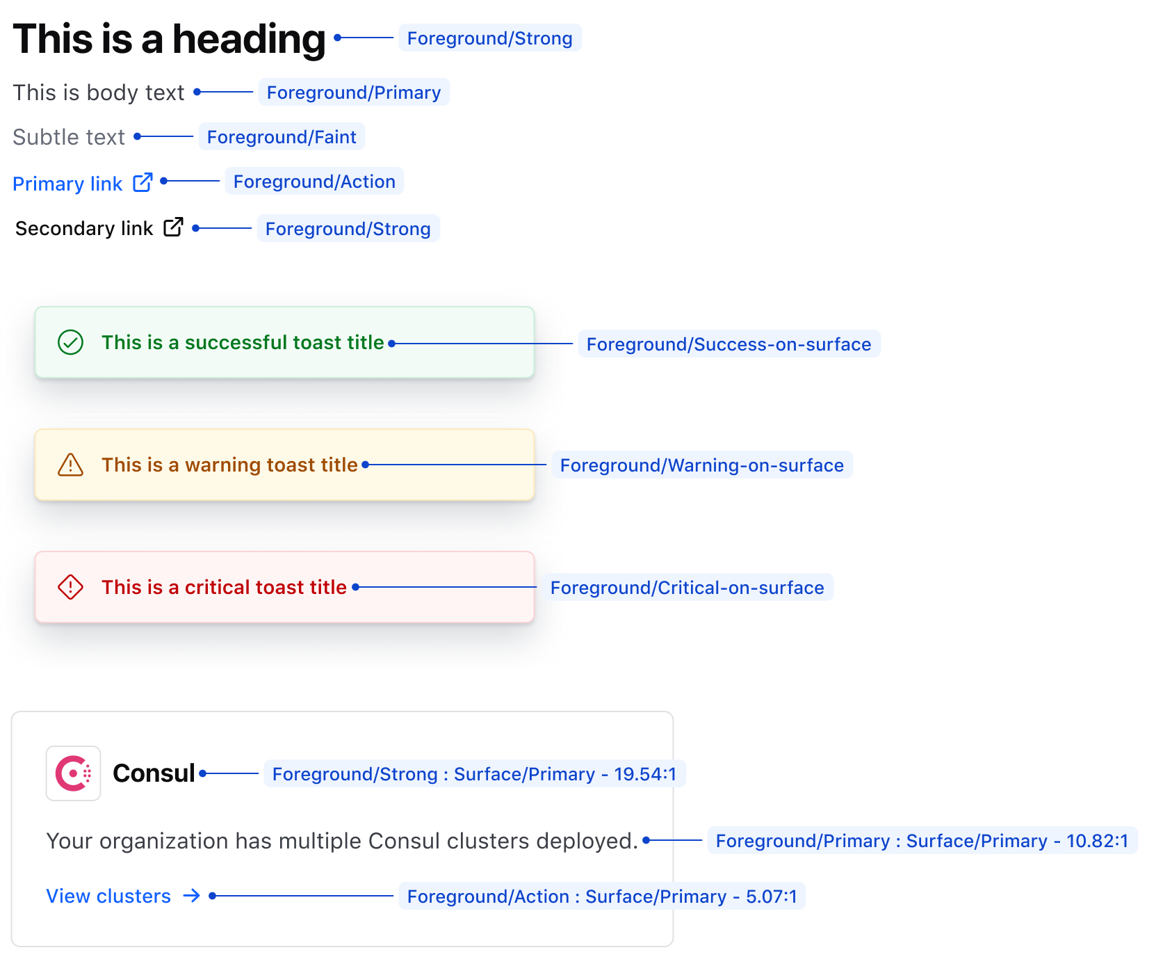
Typography that scales across devices
Created a modular type scale (12px - 32px) with a clear weight hierarchy (regular, medium, semibold). Works across mobile and desktop.
An 8px spacing system that eliminated guesswork
8px-based spacing system using semantic tokens (space-2, space-4, space-8) instead of random values. Includes standardized breakpoints for different device widths.
Elevation and borders that guide attention
Elevation patterns offset content and indicate interactivity. Borders define and separate content visually with consistent stroke weights.

Then I designed components that solved real problems
Advanced Table: Built for dense enterprise data
Designed for enterprise cloud dashboards with dense data.
48px row height (40px compact mode) for easy scanning
Subtle zebra striping and hover states for clarity
Full keyboard navigation with visible focus indicators
ARIA labels for sortable columns and actions
Accordion: Flexibility without the chaos
Flexible accordion with flush and card variants.
Clear expand/collapse icons with smooth transitions
Consistent padding across variants
Works with keyboard navigation
Tag Component: Small but mighty
Versatile tags for status, filters, and metadata.
24px height, color-coded variants (neutral, success, warning, critical)
Dismissible option with a clear close button
Compact for dense layouts

Application States: Clear guidance when things go wrong
Empty states, errors, and loading patterns.
Centered layouts with icon → heading → description → action
Consistent messaging across error types
Clear next steps


Designers were wasting 5 minutes just finding the right icon
The problem
Designers spent 5+ minutes finding icons. Led to inconsistent usage and custom icon requests.
What I did
Audited and redesigned 200+ icons.
Standardized 1.5px stroke weight at 16px base size
Unified corner radii and geometric proportions
Simplified taxonomy from 12 categories to 6
Added synonyms and use-case tags for better search
Icon discovery dropped from 5 minutes to 90 seconds
Custom icon requests dropped 70%. Became the standard reference library.


Good documentation turns a design system into a design culture
Component specs that answer every question
Wrote 20+ specification pages covering anatomy, props, usage guidelines, accessibility, and migration paths—created templates for future components.
Programs that made adoption easy, not mandatory
Office Hours: Bi-weekly sessions to answer questions and gather feedback
Token Tuesdays: Workshops on semantic token usage with migration guides
Migration Support: 1-on-1 help and before/after examples
The results
Designer onboarding improved 30%
UI support tickets dropped 25%
Component reuse jumped from 12% to 78%

Accessibility isn't a feature. It's the foundation.
Conducted 50+ component audits using Axe DevTools, VoiceOver, and keyboard testing. Validated contrast ratios, keyboard navigation, focus management, and ARIA labels. Documented accessibility specs and testing checklists for every component.
Result: 95% WCAG 2.2 AA compliance across all components.
The system that became the single source of truth
Adoption: All HashiCorp product teams now use Helios as their single source of truth (92% adoption rate, up from 65%)
Component Reuse: 78% (up from 12%)
Design Review Time: 60% faster
Feature Delivery: 35% faster across product teams
Component Bugs: 70% reduction
Support Tickets: 25% reduction
Task Completion: 65% improvement
Consistency: Unified design language across all customer-facing products
What building a design system at scale taught me
Accessibility first – Retrofitting compliance is 3x harder than building it in.
Documentation matters – Good specs drive adoption and reduce support.
Build relationships – Workshops and office hours beat mandates every time.
Visual craft scales – Systematic doesn't mean boring. Thoughtful details create polish.
Solve real problems – Address team pain points (dark mode, complex tables, icon search) to drive adoption.
What's next
I want to deepen my motion design skills and explore consumer product design. My enterprise background taught me the importance of systematic rigor and compliance with accessibility standards—I'm excited to apply that to consumer experiences focused on delight and functionality.