Helios Icon System
Redesigning an Enterprise Icon Library for Speed, Clarity, and Scale
At a Glance
Role: Product Designer (icon system lead)
Company: HashiCorp, Helios Design System
Timeline: 4 months (2024)
Team: Collaborated with Design Systems Lead and Engineering
Key Results:
Icon discovery time improved from ~5 minutes to ~90 seconds (3x faster)
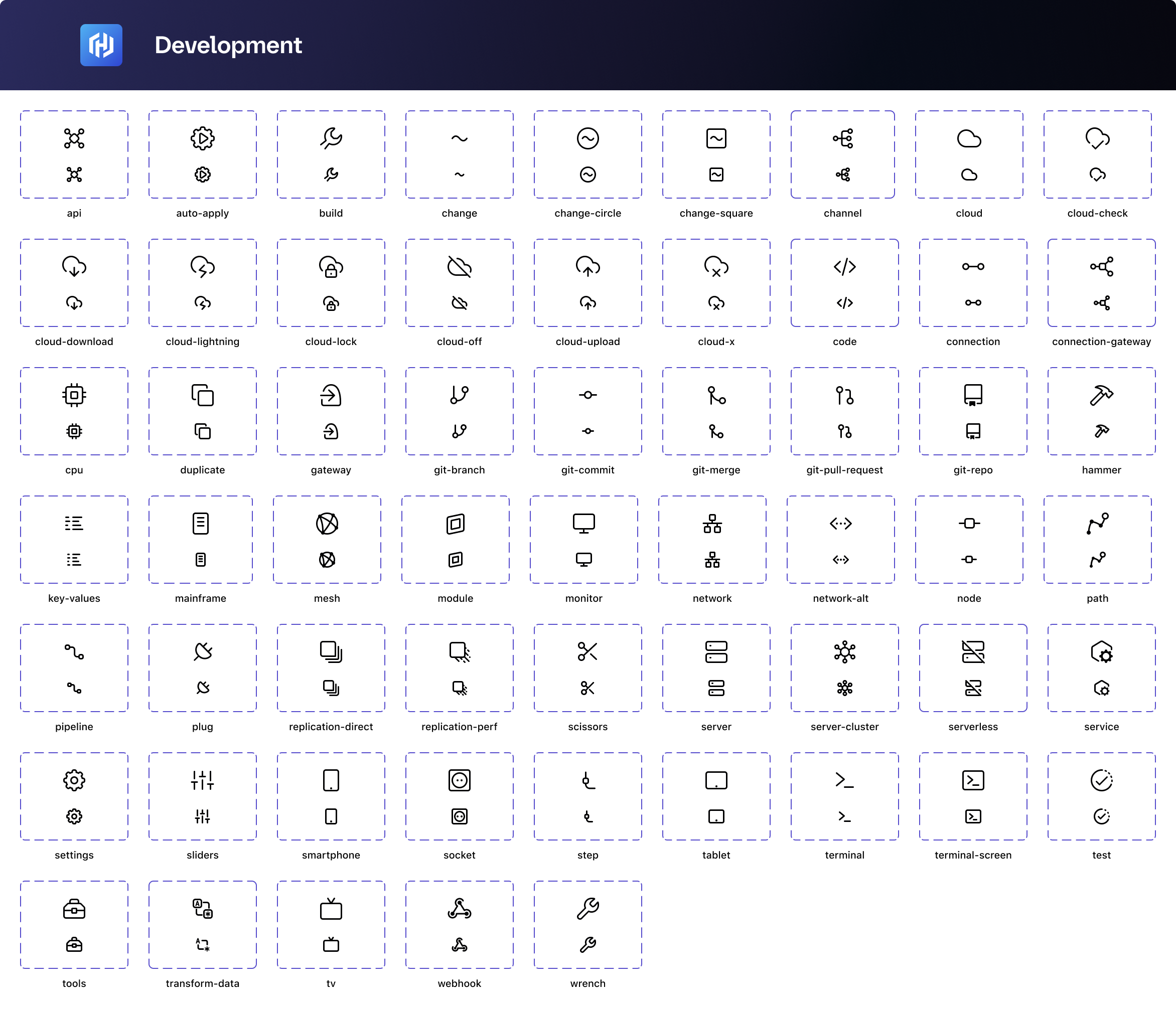
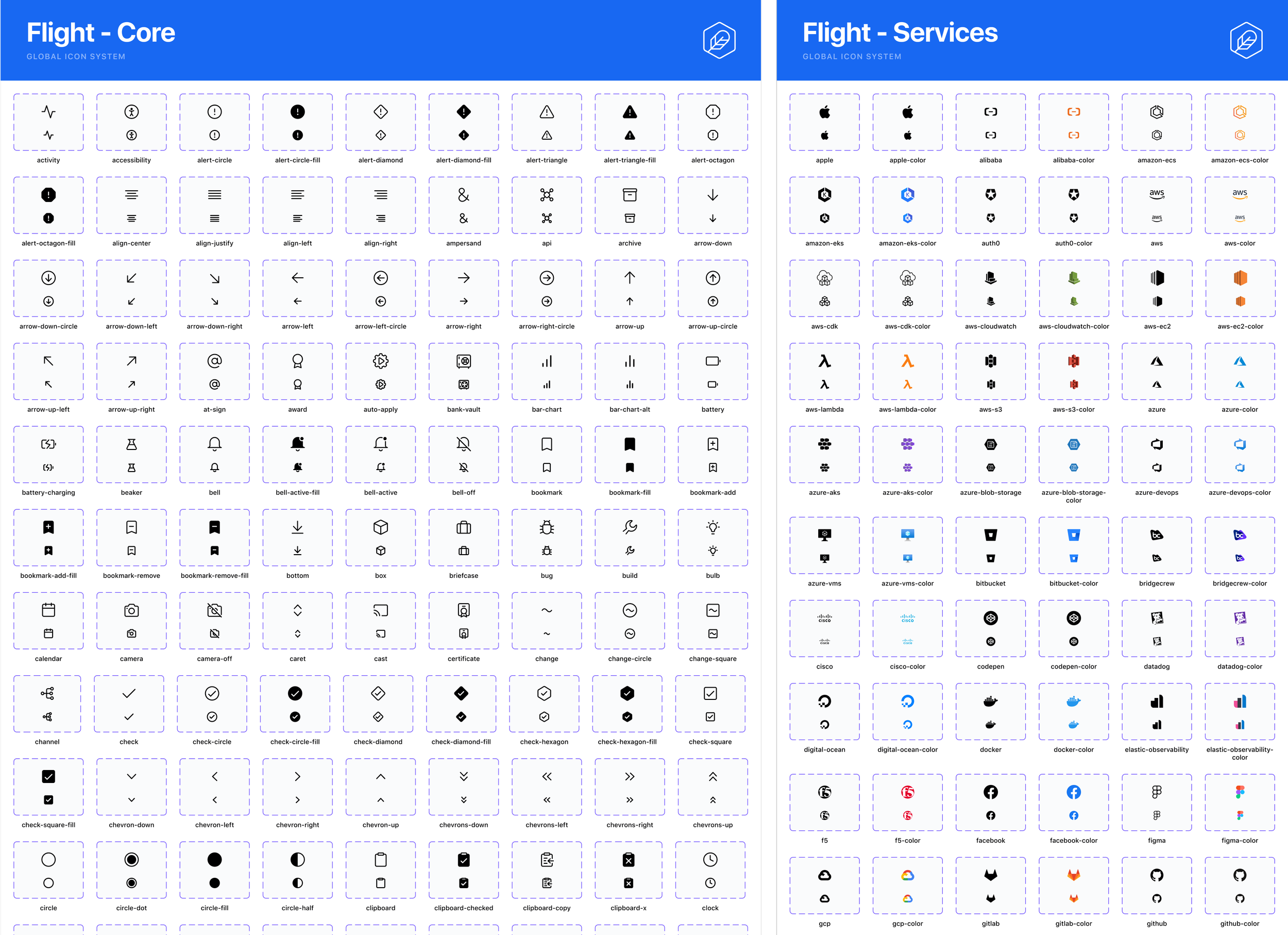
200+ icons refined for visual consistency
25+ new icons designed based on product team requests
Custom icon requests reduced by 70%
Search and browsing functionality has been completely rebuilt
The Problem
As Helios adoption grew across HashiCorp's product suite, the icon library became a significant source of friction. Designers struggled to find appropriate icons, leading to:
Search dysfunction:
Inconsistent or blank search results
Icon names didn't match common usage terms (e.g., searching "trash" returned nothing; icon was named "delete")
No keyword metadata or synonyms
Organizational issues:
No categorization or filtering system
200+ icons in a flat, unsorted list
Impossible to browse effectively
Visual inconsistency:
Icons designed at different times with varying stroke weights
Inconsistent alignment and optical sizing
No clear style guidelines for new icon creation
Business impact:
Designers wasted 5+ minutes per icon search
Teams created duplicate custom icons
Inconsistent icon usage across products
Constant Slack requests: "What icon should I use for...?"
Version 1
Version 2
Version 3


Research & Discovery
To understand the full scope of the problem, I conducted:
User interviews (8 designers, 4 engineers):
Observed icon selection workflows in real design files
Documented search terms and strategies
Identified pain points and workarounds
Usage analysis:
Audited 15+ product files to see which icons were actually used
Tracked most-requested custom icons
Identified missing icons across product teams
Competitive analysis:
Studied icon systems from Material Design, Phosphor, Lucide
Analyzed taxonomy and metadata approaches
Evaluated search and filtering patterns
Key Insights
Discovery patterns:
70% of users guessed icon names or asked teammates
Designers wanted to browse by category, not just search
Functional vs. decorative usage was unclear
Most common searches: "delete," "edit," "close," "add," "download"
Visual consistency gaps:
Stroke weights ranged from 1px to 2px, inconsistently
Corner radii varied (some 1px, some 2px, some fully rounded)
Optical sizing issues made some icons feel heavier than others
Alignment to the pixel grid was inconsistent
Design Solution
1. Visual Refinement & Standardization
Established clear visual guidelines ensuring every icon felt cohesive:
Stroke weight: Standardized to 1.5px for optimal clarity at 16px base size
Corner radii: Unified to 2px radius for consistent geometric treatment
Optical balance: Refined negative space and weight distribution for visual harmony
Pixel alignment: Ensured all icons aligned to the pixel grid, preventing blur at small sizes
Icon families: Created visual relationships (e.g., all "file type" icons share a geometric base)
Refinement process:
Audited all 200+ existing icons against new standards
Redesigned 100+ icons requiring significant updates
Maintained recognizability while improving consistency
Documented design guidelines for future icon creation
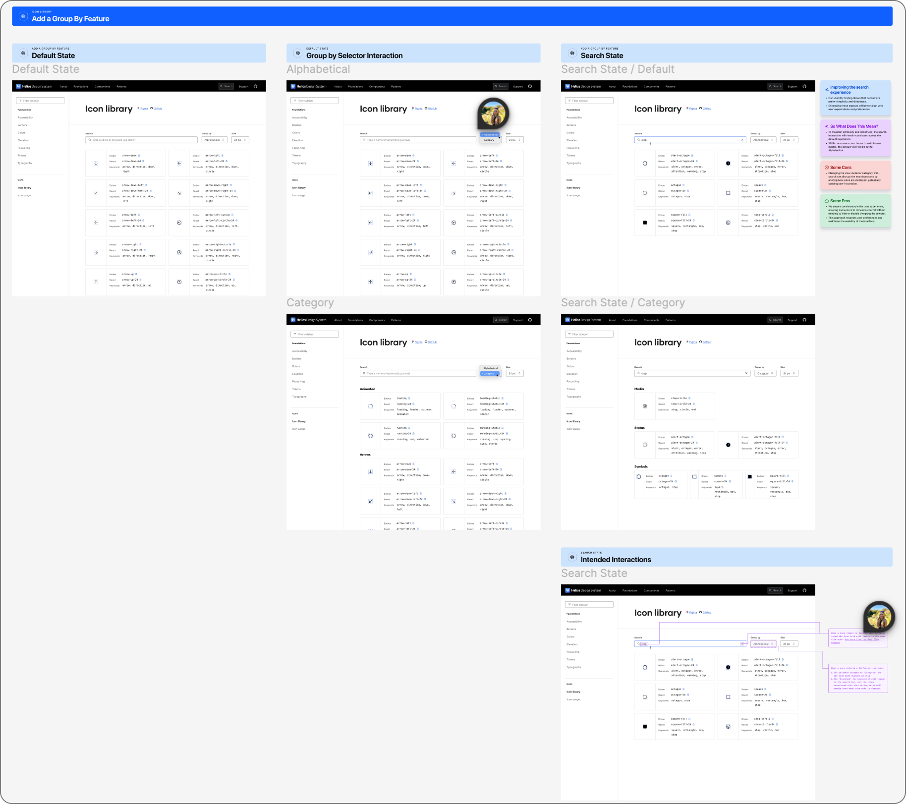
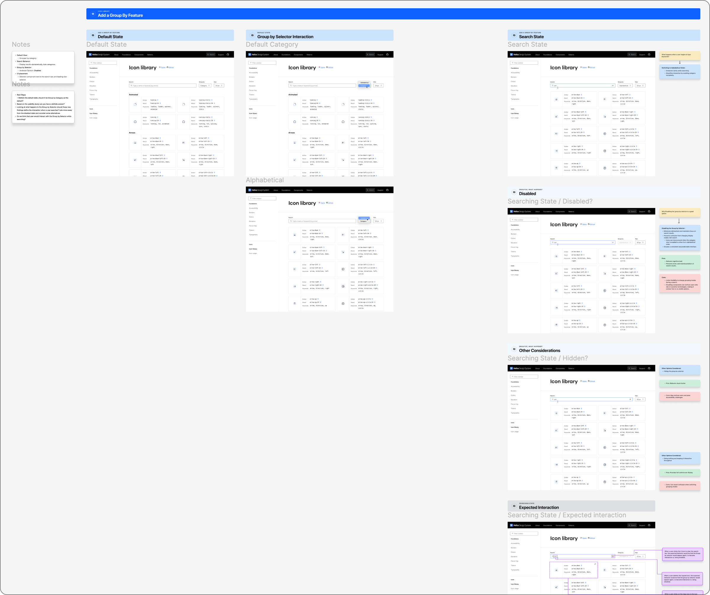
2. Taxonomy & Organization
Created an intuitive category system based on actual usage patterns:
6 primary categories:
Actions (edit, delete, add, close, search)
Navigation (arrow, chevron, menu, external-link)
Communication (mail, message, notification, alert)
Files & Data (document, folder, upload, download)
Status & Feedback (check, warning, info, loading)
Media & Content (image, video, audio, play)
Why six categories:
Research showed users think in functional contexts
Small enough to browse entire categories
Large enough to avoid over-fragmentation
Aligned with standard mental models from user interviews
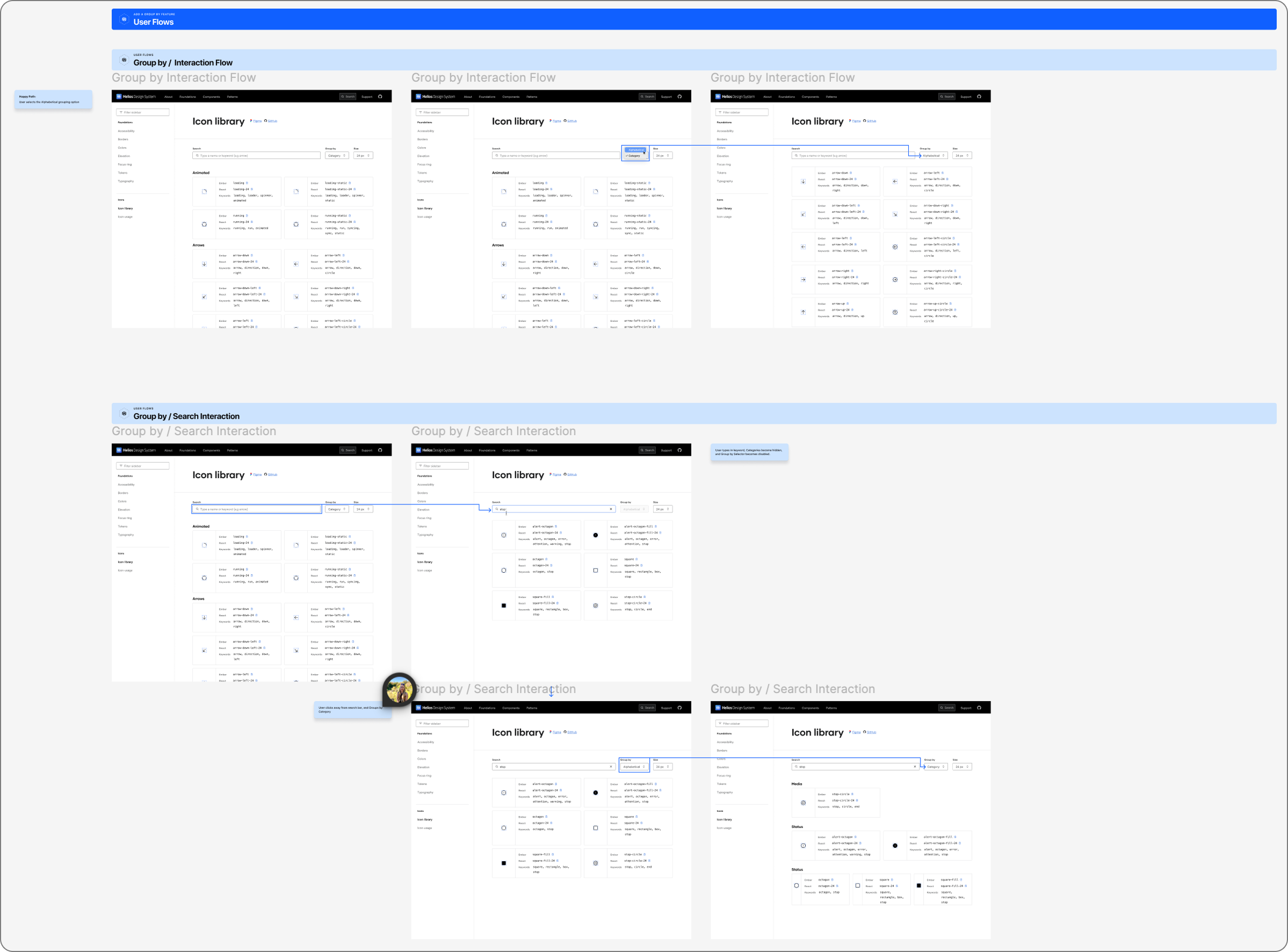
3. Metadata & Search Enhancement
Rebuilt the searchability foundation with comprehensive metadata:
Enhanced naming:
Primary name (what we call it): icon-trash
Common alternatives: delete, remove, discard
Context keywords: bin, garbage, clear
Metadata structure:
Icon: trash
Category: Actions
Keywords: delete, remove, discard, bin, garbage, clear
Use case: Deleting items, removing content
Size variants: 16, 24
Search improvements:
Fuzzy matching for typos
Synonym support (trash/delete both work)
Category filtering
Usage context hints in results
4. New Icon Creation
Designed 25+ new icons addressing the most frequent product team requests:
High-demand additions:
Cloud storage icons (upload-cloud, download-cloud, cloud-sync)
Data visualization (chart-bar, chart-line, chart-pie)
Security indicators (shield-check, lock-open, key)
Product-specific needs (terraform-logo, vault-logo)
Design process:
Validated need with product teams
Sketched multiple directions
Applied established visual guidelines
Tested at multiple sizes (16px, 24px, 32px)
Documented usage recommendations
5. Documentation & Guidelines
Created comprehensive documentation enabling teams to use icons correctly:
Usage guidelines:
When to use icons vs. text labels
Appropriate icon sizing for contexts
Color and accessibility considerations
Icon button touch targets (44x44px minimum)
Contribution guidelines:
How to request new icons
Design standards for custom icons
Review and approval process
Implementation
Collaborated with engineering to ship the complete system:
Figma library updates:
Reorganized the library with a category-based structure
Updated all icon components with new metadata
Created searchable text styles in component descriptions
Added usage examples to component documentation
Helios website integration:
Rebuilt icon page with category filtering
Implemented improved search with keyword matching
Added copy-to-clipboard functionality
Created download options for different formats
Migration support:
Documented icon name changes
Created Figma scripts to update instances automatically
Provided migration guide for product teams
Impact & Results
Quantified Improvements
Discovery speed: Icon search time reduced from ~5 minutes to ~90 seconds average (3x improvement)
Request reduction: Custom icon requests dropped by 70%, from ~8/month to ~2/month
Adoption increase: Icon library usage in product files increased from 60% to 95%
Support burden: Icon-related Slack questions decreased by 80%
Qualitative Feedback
"I can actually find icons now without asking the team." — Product Designer, HCP
"The categories make so much sense. I browse instead of searching now." — Product Designer, Vault
"Visual consistency across products has noticeably improved." — Design Systems lead
System Scalability
The new foundation enables ongoing icon development:
Clear design standards for future additions
Documented contribution process
Established governance model
Scalable metadata structure
What I Learned
Visual consistency is functional, not just aesthetic. Users recognize and recall icons faster when they're systematically consistent. The 1.5px stroke standard and unified corner radii made the entire library feel cohesive and professional.
Taxonomy design is user research. The category system worked only because it reflected how designers actually think about icon usage, not how I thought they should.
Metadata is infrastructure. Spending time on comprehensive keyword and synonym research felt tedious, but it was the most impactful work I've done. Great search is invisible; it just works.
Documentation drives adoption. The visual refinement was meaningless until teams understood when and how to use icons appropriately. Usage guidelines turned a component library into a proper system.
Small improvements compound. 3 minutes saved per icon search × 20 icon searches per designer per week × 12 designers = ~12 hours saved weekly. Systemic friction costs add up.
View the Live System
The updated icon library is now:
Searchable in Figma with category organization
Fully browsable on helios.hashicorp.design with advanced filtering
Used across HCP, Vault, Terraform, and Boundary products